In the post on La Brea Liquor, I asserted that “a modernizing style, connoting mature sophistication, is a good fit with selling products whose use is often considered to be a vice.” This post is a survey of a specific element by which that sense of sophistication was pursued, the representations of liquor vessels on the signage of mid-century Los Angeles liquor stores. For these independently owned liquor shops, these representations function as surrogates for the graphic logos of branded chain stores. Taking their visual cues from modern art, these representations abstract the forms and colors of bottles and glasses, suggesting something more elegant and otherworldly than the cheap buzz typically sold inside.
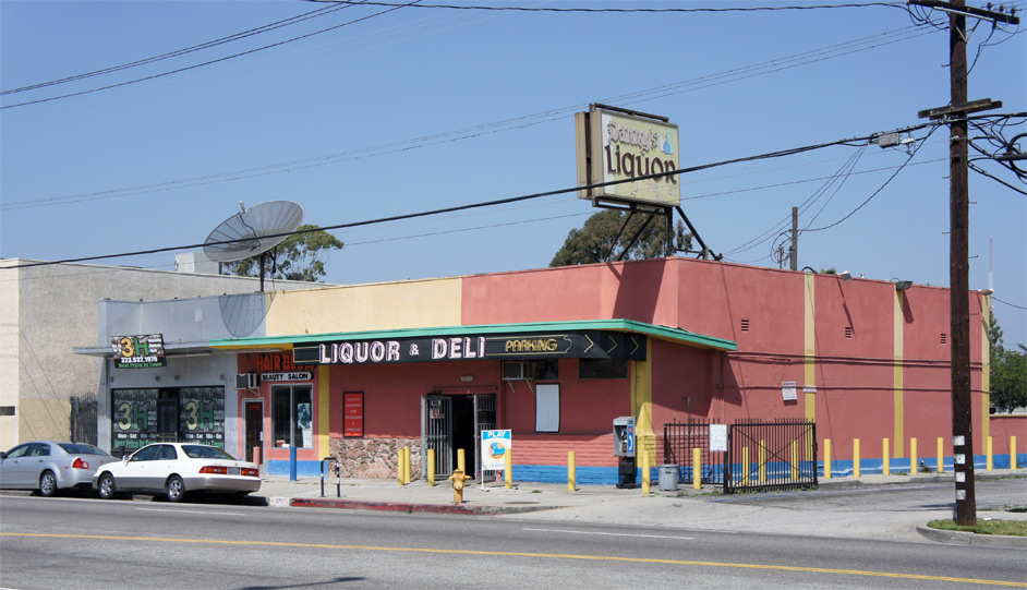
The chief architectural distinction of Danny’s Wine Cellar on Rodeo Road near La Cienega Boulevard is a diagrammatic paint job. The liquor store once had more storefront windows turning the corner, but these have been replaced and stuccoed over. A zone of rock-faced wall and another of now-painted concrete masonry flank the entry of what is otherwise a plain stucco box adorned with signage.
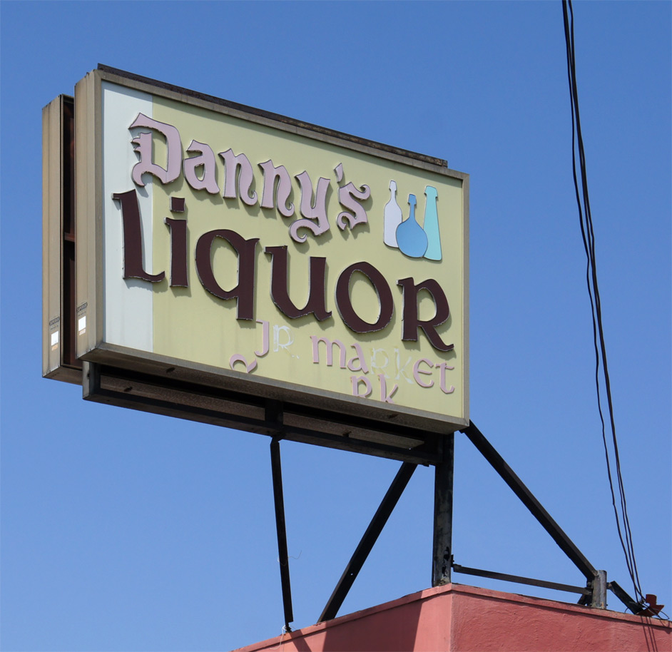
The lightbox sign for Danny’s Liquor Jr Market uses the deluxe fabrication style – the plastic letters are individually raised from the sign’s surface and outlined with an unpainted metal edge. The style is medievalizing; the letterforms are a kind of cross between an uncial and a blackletter script, indistinctly evoking a time when hale fellows met at ye olde tavern for a grog. Three bottles in unnatural hues punctuate the sign; the composition is loose, and the exaggeratedly wide heads of the bottles vaguely anthropomorphic. Those bottles might represent you, your fat, short friend, and your tall, slope-shouldered friend happily congregating.
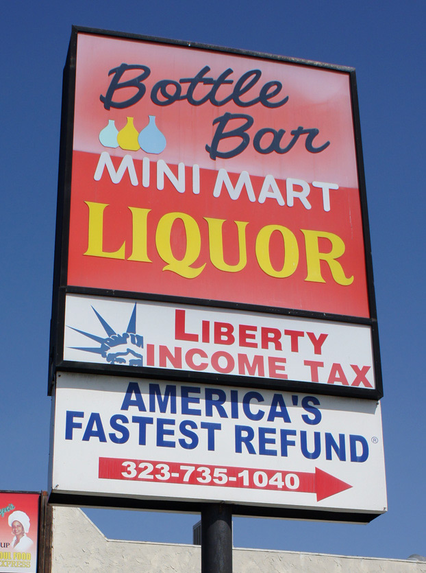
The sign at Bottle Bar Mini Mart Liquor on Crenshaw Boulevard near Adams employs three radically different letter types. The Bottle Bar legend in script looks spirited.
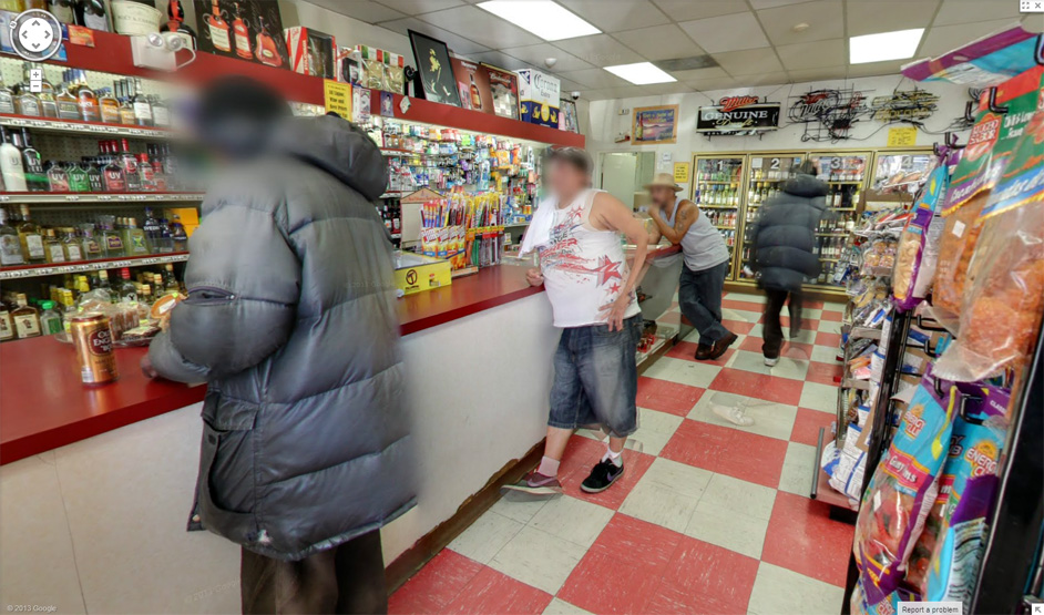
Bottle Bar is aptly named – Google Street View went inside for us and revealed that customers do stand at the counter as though it were a bar.
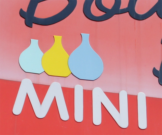
The three-bottle logo looks hand-cut and forms a more orderly composition than that at Danny’s. Rendered in easter-egg colors, these bottle shapes look less like liquor bottles and more like the magic potion jars one sees in Dungeons and Dragons-inspired video games that exercise magical healing powers upon use. “Red Wizard shot the potion!”
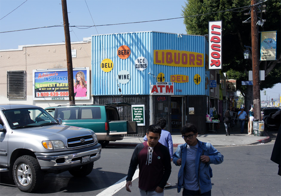
Superior Liquor on Pico Boulevard at Fedora Street is older than it looks at first glance. In its massing, it resembles the many mid-century buildings that have a decorative architectural front that negotiates a transition to an unadorned, boxy stucco rear; but in this case the exposed anchor plates reveal that this is an unreinforced brick building that has been seismically upgraded. Originally built in 1907 per the Assessor’s records, the entire front must have been replaced around 1960. The multicolor polka dots against the three-dimensional striped field of blue, corrugated siding have a strong visual impact.
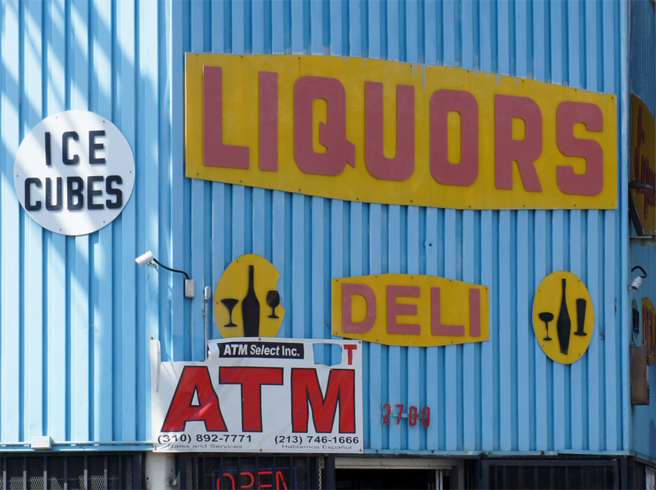
This inexpensive colored plastic signage is screwed directly into the corrugated siding, a highly expedient approach that has nonetheless endured the passing of decades fairly well. The signage looks distinctly handmade. On the left side a polka dot contains a tapered wine bottle flanked by a cocktail glass and a wine glass, all standing on different planes. On the right a shapelier, more feminine bottle is flanked by a champagne coupe and a footed pilsner glass, aspirational symbols for an inner-city liquor store. If the International Commission on Technology and Accessibility were to develop an international symbol for liquor understandable even to the most blotto illiterates, it might look something like these.
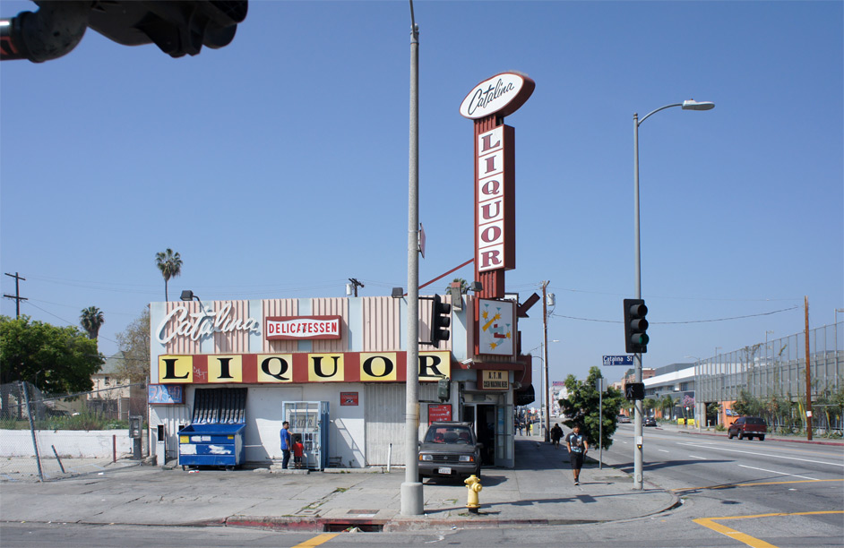
Catalina Liquor at the corner of 8th and Catalina has a remarkable full palate of signage types. As a graphic background for the applied signs, corrugated siding is used in bands to create two scales of striping. The script of Catalina is rendered with a loose hand. The tall pylon, crowned by a Catalina-brand football, focuses attention at the entrance with arrows that were at one time lighted.
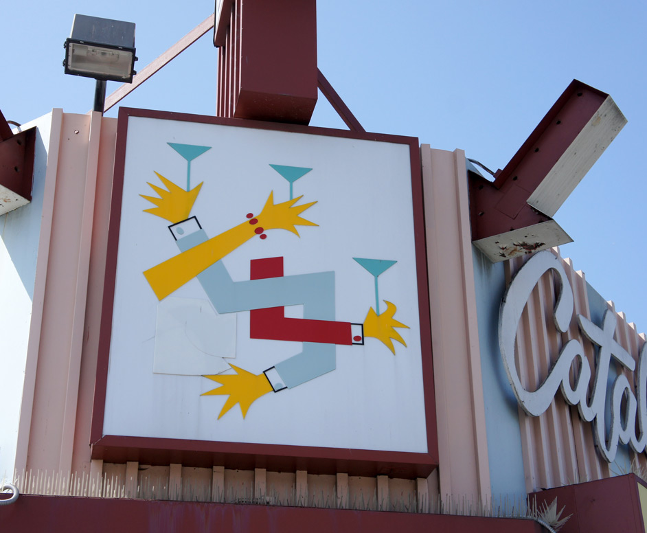
Over the door is placed this striking artwork. This knot of primary colors brings to my mind the logo of the 2012 summer Olympic Games. Evoking the energy of a Playboy reader’s wild cocktail party, the intertwined, disembodied limbs with hands that look like Lisa Simpson grasp their martini stems with casual sprezzatura. Prior to the repair, it appears that the double-ended arm snake would have held glasses at both ends – he must be the host. This is a high point in the use of the martini glass as a symbol for sophistication.
Leave a Reply