If there were such a thing as a protypically Lower Modern building, La Brea Liquor might be it, in terms of both building type and style. As I have argued previously, the Lower Modernisms is a plural term because it encompasses a plurality of styles, so there cannot really be one prototype to stand in for the the LoMos as a whole. But my posts heretofore feel heavy with the burden of reflecting on what the Lower Modernisms project is, as I stake out its scope and theoretical groundwork; and none of the previous posts describe any buildings that could be considered typically Lower Modernist in character. With this post, we leap straight into featuring a righteously Lomo building.
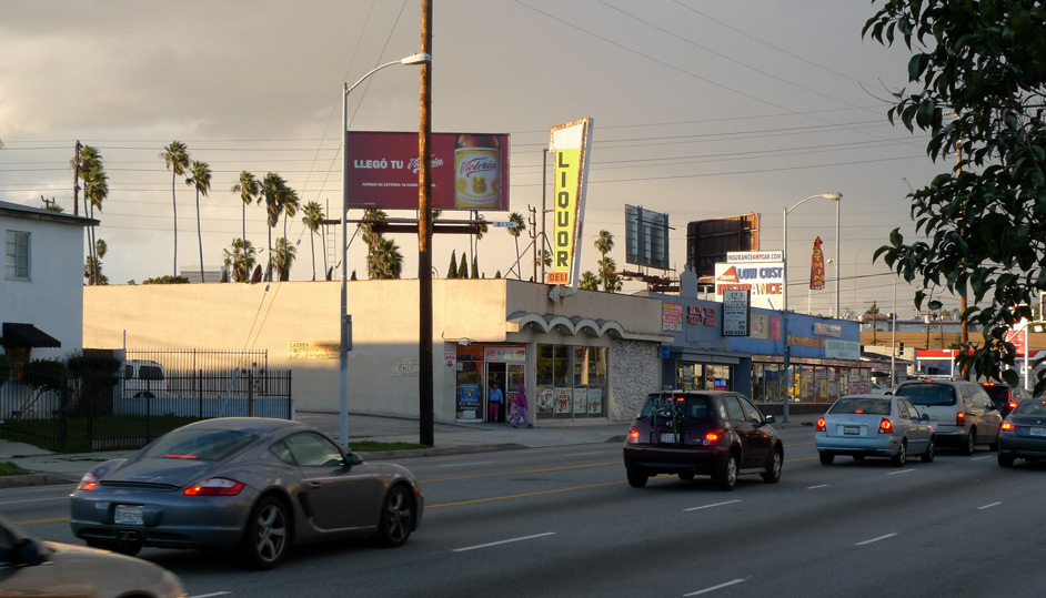
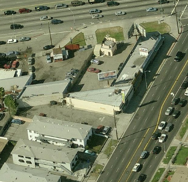
The La Brea Liquor store occupies a unique triangular site just south of Venice Boulevard. The shape of the lot is an artifact of Venice Boulevard’s skewed path across the city grid; this small triangular parcel of 8,000 square feet includes both the parking lot and the store. An image appropriated from bing.com’s birds-eye views:
Liquor stores are an example of a building type that is commonly Lower Modernist in style – not that liquor stores need to be Lomo in style, but the fact that they tend to be Lomo tells us that there is something intrinsic in this building use (what architects call Program, although I think I shall stick to the preferred English spelling, “Programme”) that inclines liquor stores to be Lomo. The primary factor that makes a building type intrinsically Lomo must be that many of them were built in the years 1950-1970, which is surely the case with liquor stores; but it is also the case that a modernizing style, connoting mature sophistication, is a good fit with selling products whose use is often considered to be a vice.
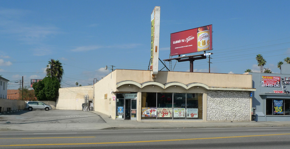
The building is 2,200 square feet, a triangle comprised of two side walls of concrete masonry units and a storefront at the sidewalk lot line. The front façade is two-thirds glazed aluminum storefront, maximizing visibility into the interior and allowing the store to appear to glow attractively at night.
The architectural features that distinguish this building from a dumb box are few and conspicuous. One-third of the front façade is an opaque wall finished in rubble rock, a cheap means of giving the building some texture – the Flintstones look of rubble wall can probably be traced through Googie back to Frank Lloyd Wright. This building was built in 1964, and looks the part.
A second architectural element is the projecting faux-roof, consisting of four wave-like curved sections over the storefront, and a flat section over the rock wall. These projections suggest that the building’s roof is constructed of linked barrel vaults, but this is of course not the case, and they are purely decorative. It is an architectonic language used for the decoration, though, ornament derived from familiarity with construction practice.
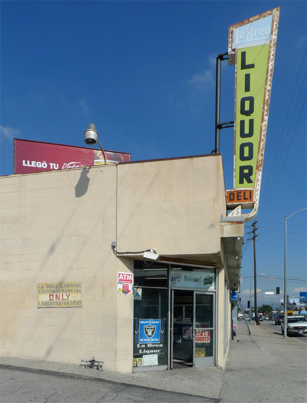
As with many liquor stores, the sign is the primary aesthetic move. Cantilevered from the roof, its shape is a jaunty truncated triangle, unconsciously echoing the shape of the building in plan. Bright primary colors on translucent plastic and a mix of letterform styles are integrated by the arrow that wraps the whole and points to the store interior – sadly the lightbulbs that follow the arrow no longer glow.
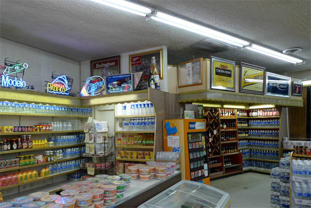
I ventured inside one evening to see how the architecture continues inside the shop. After buying a bottle of gin, I attempted to ask the clerk through the panels of bulletproof glass whether I could take a few pictures inside, absurdly attempting to explain that It’s okay, I’m an architect. I’m not sure he fully grasped the tremendous architectural import of his shop. But the fact that I proceeded to photograph it anyway showed me that I will go to such lengths to study the Lower Modernisms as to behave suspiciously in ways that might get my ass kicked for no good reason. I have therefore promoted the Lower Modernisms project to the top of my list of Things Most Likely to Kill Me Prematurely. Congratulations!
The surface-mounted fluorescent lights highlight the texture of the ceiling nicely. The shelves are terminated by shapely bookends of woodgrain plastic laminate. The best use of materials inside is definitely the backlit panels over the shelves:
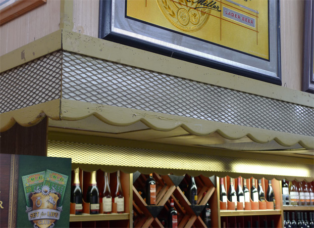
These panels consist of a mesh of expanded metal (steel sheet with a grid of slits punched into it, stretched to create the characteristic pattern of diamond-shape openings) over translucent plastic signboard, edged with decorative wood trim. Expanded metal is often used as a structural lath to support cement plaster (stucco) – these panels represent a novel use of inexpensive materials for decorative effect.
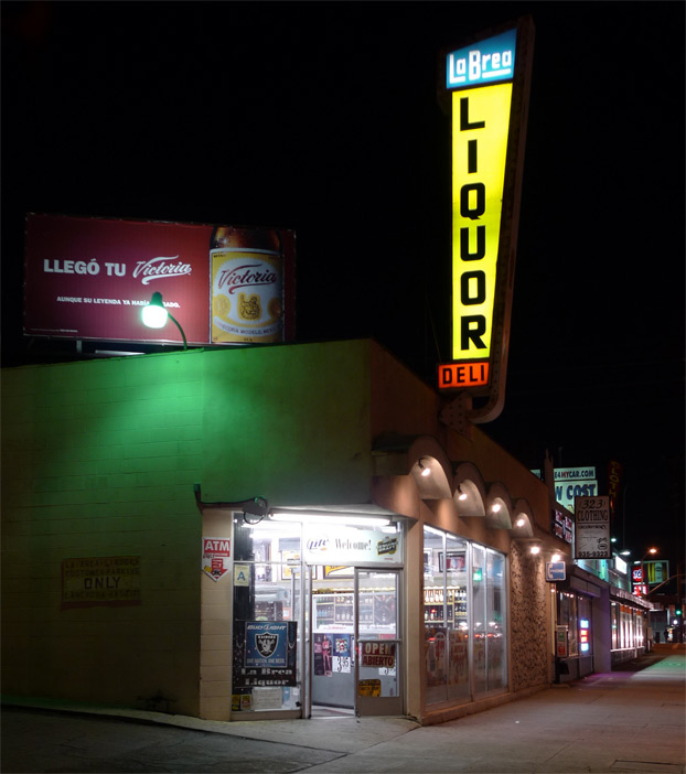
The colors of the sign have a greater impact at night, but the light-up arrow surround is dearly missed. The lights tucked under each projecting faux-barrel vault are a nice touch.
Leave a Reply