Lloyd’s of Running Springs was established in 1953 as the primary nice restaurant in the town of Running Springs, a mountain community of 5,000 persons in the San Bernardino National Forest and a way station in between Lake Arrowhead and Big Bear Lake. It appears to have ceased operations within the last decade, although the building and Lloyd’s signage are still visible in Google Street View imagery. Comparison of this 1960s postcard image with a more recent photo show that the property had been updated, with the stone walls of its original Lodge Moderne style replaced with brick for more of an English cottage look. With the construction of remodels, additions, and an ugly new sign, Lloyd’s had been made to look substantially less cool.

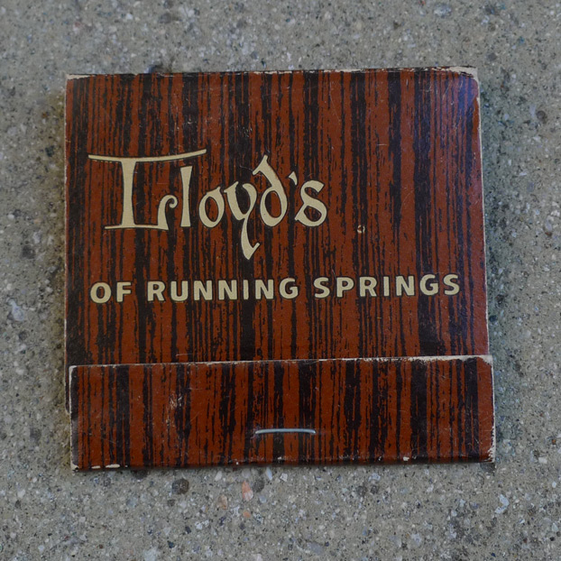
The matchbook is straightforward, employing only brown and black ink on a tan-colored stock. “Lloyd’s” is penned in a distinctive hand with serif-like flourishes, and as Carmen Cham pointed out, the distinctive capital L makes it look like it says “Irloyd’s” with a ligature. The tan letters are outlined in black so that they pop against the background.

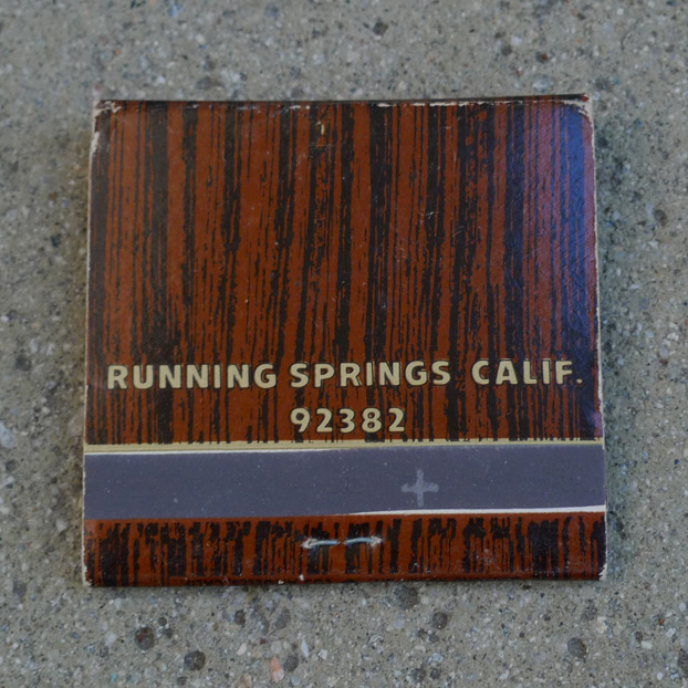
On the backside, we see a slight misregistration between the brown and black inks, but this does not detract. The wood-grain effect of the background complements Lloyd’s woodsy location and presumably a woodsy, hearth-filled interior as well. The pattern is not too literal, looking less like a deliberate reproduction of wood grain, and more like the brush strokes of a dry brush.

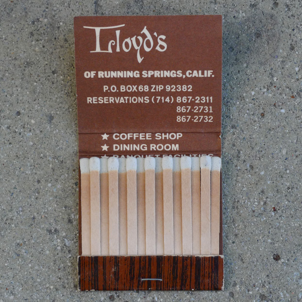
* COFFEE SHOP
* DINING ROOM
* BANQUET FACILITIES
* COCKTAIL LOUNGE
* BAKERY

Leave a Reply