The Erwin Street Commercial Center (ESCC) at 15500 Erwin Street, Van Nuys, Los Angeles, is a diagram building of unexpected rigor and quality. It resembles an architecture student’s design project – specifically, it looks like about three-quarters of my own studio projects, which had a tendency to expose their structural frames and adorn their exteriors with circulation elements.

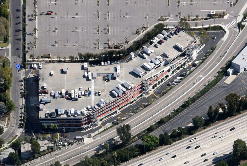
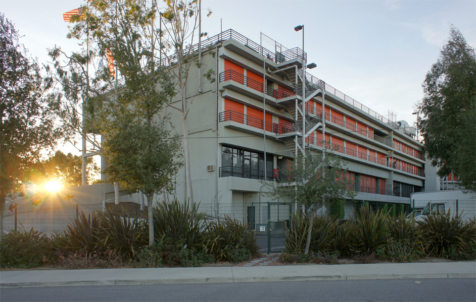
From this view, the ESCC’s massing resembles a late-Modern baseball stadium more than anything else, but it is actually a drive-in, drive-thru storage building and parking garage with a smattering of commercial office space.
The massive scope of this 400,000 square-foot, porkchop-shaped building can only be grasped from a distance. Its profile neatly follows the contours of an irregular parcel caught between Interstate 405 and a park-and-ride lot serving the Orange Line Bus-Rapid-Transit station at Sepulveda Boulevard. Courtesy of Google Maps:
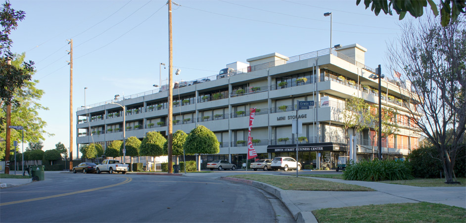
The ESCC’s façades present varying aspects without seeming incohesive. From the front, where the ESCC’s north façade improbably towers over a row of single-family homes, it could almost pass as an office building.
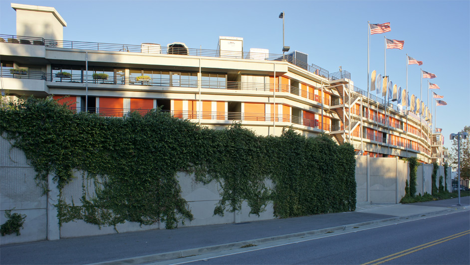
The ESCC’s west façade is made seemingly endless by a shallow curve that follows the property line, and the horizontal emphasis of its exterior elements recalls ocean-going vessels. The ESCC is an anonymous participant in the high-architectural tradition of taking inspiration from ocean liners, and bares comparison with the 1966 Wyndham Court project by Lyons Israel Ellis in Southhampton, England, described by Owen Hatherley as “a glorious concrete Cunard” that “immediately evokes the cruise behemoths that sailed from the nearby port” (7). The ESCC looks rather more like a container ship.
The ESCC resembles a number of English “Megastructure” projects designed and built in concrete in the 1960s and 1970s, although it lacks academic pedigree. It is a lomo megastructure, in its pragmatism and humility closer to the anonymous industrial structures that Reyner Banham termed “Mégastructures Trouvées” in his book Megastructure: Urban Futures of the Recent Past. Its integrated exterior vehicular circulation ramps and skeletal, ancillary stair towers even permit comparison (and contrast) with the Pompidou Centre. The ESCC’s easygoing modern detailing suggests that its designers, probably working in the mid-1980s, might well have had some of these high-modernist precedents in mind while they struggled to transform this commission for a vast mini-storage building into a work of Architecture.
Even though it does not quite fit the criteria, the ESCC’s monumental scale and rugged frame have earned it an honorary place on my just-launched Google Map of Brutalist architecture in Los Angeles: http://g.co/maps/33c44. For the sake of this exercise, I have assumed a working definition of Brutalist Architecture as buildings with an exposed, unpainted, cast-in-place structure of architectural concrete. Leave a comment below if you care to contribute any good candidates and I will add them to the map, which someday may form the basis for a Los Angeles Brutalism bicycle ride. I have not input any university buildings yet, as these will tend to overwhelm all others in their numbers and quality. Nor have I included Orange County, where ruggedly handsome architectural-concrete public schools serve unappreciative suburban children.
Although they are not architecture, the freeway interchanges are surely the most stunning works in the Brutalist design language in Los Angeles. It would be a fruitful exercise to analyze the great freeway interchanges, neither as sculpture nor from a traffic circulation perspective, but as architecture – to diagram the way they define the space above, below, and around their contours.

The nondescript pale beige of the frame is enlivened by the painting of the steel roll-up doors of individual storage spaces a version of International Orange, well established as the default color for storage units by the Public Storage real estate investment trust.
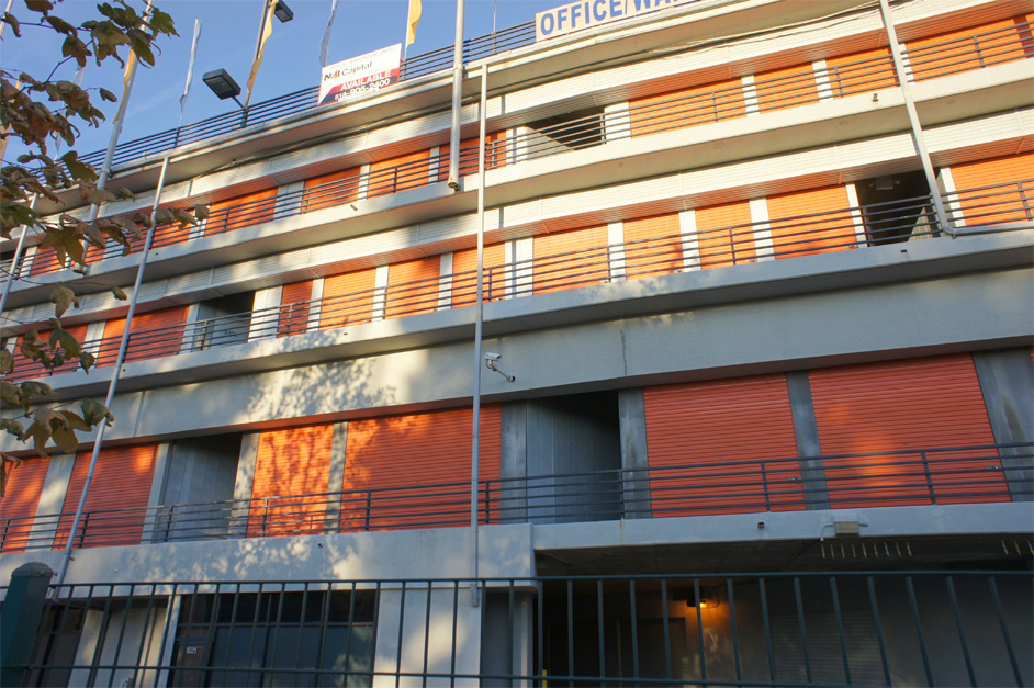
The façade’s monotony is relieved by the varying widths of those roll-up doors, accented by the unpredictable, jazzy rhythm of the punched holes of hallways leading to the interior and the syncopation of vertical posts and pipes tacked onto the outside of the frame.
Commercial office space behind glazed storefronts is sprinkled about the edges at the top and bottom of the building in a seemingly random sandwich of office space with storage space.
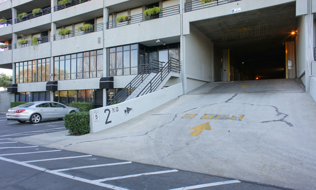
The visual interest of the ESCC is programme-driven. It resembles the cross-programmed buildings featured by Atelier Bow-Wow in their book, Made in Tokyo, the unique forms of which were derived from Tokyo’s combination of relaxed zoning controls and intensive use of space; in particular, the “Car Tower” (page 72), the “Delivery Spiral” (86), the “Truck Tower” (92), and the “Tokyo Dispersal Centre” (162).

The ESCC’s construction is in the mode of cast-in-place concrete parking garages, its frame, relatively slender in appearance, left exposed.
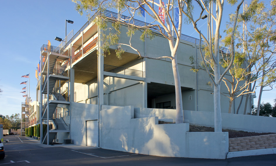
All the goodness comes together at the southwest corner, perhaps not coincidentally the most visible to northbound traffic on the 405 Freeway. Here more than anywhere, the building resembles a concrete frame that has been conceived as a matrix into which diverse elements can be plugged – vehicular circulation ramps, stair towers, storage units with roll-up doors, a ground-level storefront office space. This is a successful visualization of the idea of the “plug-in city” in which programmatic components are fit as needed into a more permanent frame, such as the 1981 “Highrise of Homes” project by James Wines’ firm SITE, of which idea there is a good run-down on the ArchiTakes blog.
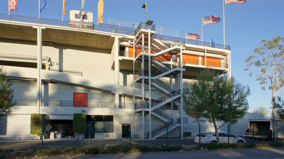
Behind a jaunty row of multicolored flags on the roof is parked a lone RV on the roof, calling to mind the 1967 “Free Time Node Trailer Cage” project by Archigram. Plug in your home node!

Above the ramp, two orange-doored structural bays of storage space were grabbed – they had to be, for compositional as much as pragmatic reasons.

My photographs linger on this great moment, where the flags flap against a blue sky atop the dynamism of the ramp and the skeletal stair tower. It put me in mind of the playful amusement architecture of Camelot Golfland and its waterslide tower, which is a wonderful and unique characteristic for a mini-storage facility to possess.
Bibliography:
Banham, Reyner. Megastructure: Urban Futures of the Recent Past. New York: Harper & Row, 1976.
Cook, Peter, ed. Archigram. New York: Princeton Architectural Press, 1999.
Kaijima, Momoyo, Junzo Kuroda, and Yoshiharu Tsukamoto. Made in Tokyo. Tokyo: Kajima Institute Publishing Co., 2001.
SITE. New York: Rizzoli, 1989.
Leave a Reply