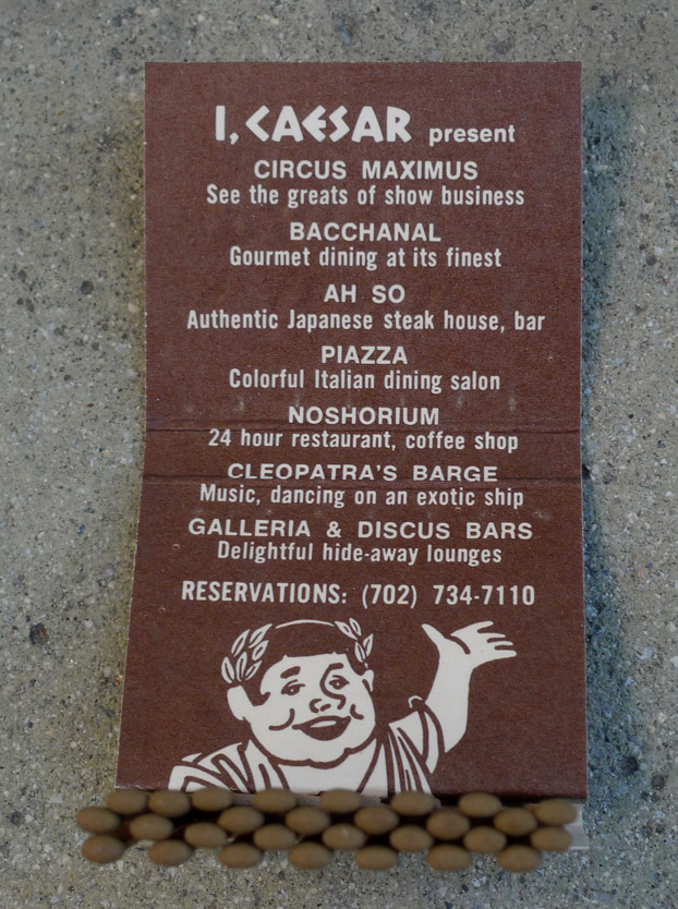
This matchbook looks as though it must be at least 1500 years old, with its edges oxidized like ancient parchment. But do not be fooled, it is all part of the illusion!

The letterforms that make up the “CAESARS PALACE” logogram are inspired by Roman inscriptions, i.e., this kind of thing. The characters are made up of the kind of short strokes that you might want to use if you had to carve each character out of a rock. The arrangement of letters, slightly irregular on their baseline, has a jaunty and vaguely mid-century feel to it.

Other manifestations of the Lower Modernisms colonized exotic cultures and vernacular forms as a basis for a humanized alternative to mainstream High Modern practice, as seen for example in the diverse realms that make up Disneyland or the exotic locales implied by various holes at Camelot Golfland. Caesars Palace mined the image of Ancient Rome for material in precisely the same way, and the Roman imagery was particularly well suited to Las Vegas, combining as it did the elegance and hedonism that together have formed the image by which Vegas is marketed and sold. Although I now clearly see how campy and knowing Caesars Palace used to be, as suggested by the cartoon-like image on the backside of this matchbook, in my youth I somehow carried an image of the place as a serious and imposing institution. It must have been all those Corinthian columns.

Long after Post-Modernism transformed historicizing architecture, once again, into a deadeningly earnest pursuit, Caesars Palace has forgotten its own joke and its character is defined by high-end shopping malls and serious restaurants. The “Noshorium,” the “Ah So” and the “Circus Maximus” are long gone.

Leave a Reply