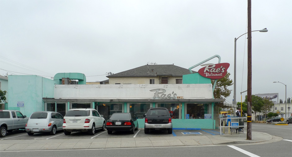
On the gloomy 24th day of September, four participants of the Googie Coffee Shops Bicycle Ride Series earned their stripes and cruised over to Rae’s Restaurant, at 2901 Pico Boulevard in Santa Monica. A humble but righteous little shop, Rae’s was designed by A. L. Collins in the 1950s (1952 according to Googie Redux; 1953 according to Santa Monica city records; “Since 1958” according to the menu – Rae is lying about her age).

The long façade, facing the parking lot along Yorkshire Avenue, expresses a strong horizontality, conveying a design language more Streamline-Moderne than Googie. Rae’s has the gestalt of a diner and man, it looks old.

The front façade on Pico conforms more closely to the orthodox of Googie. The neon “Rae’s Restaurant” in jaunty script is set against a sign in the irregular rounded shape Morris Lapidus called a “woggle.” Although from the exterior it appears arbitrary, the sloping parapet relates to an actual sloping roof structure appreciable from inside. The horizontal canopy, with rakishly raked edge, wraps around the corner of the building; an awning immediately below it creates a sense of wrongness much as one gets upon seeing a man wearing two baseball caps at the same time. The rock-covered accent wall, opaque and solid, expresses the service-oriented side of the building containing the kitchen, but the thinness of this veneer is paradoxically highlighted by the bright yellow paint on the side wall. Rae’s is a jumbled composition.

Focusing on its signage, Alan Hess described Rae’s in Googie Redux:
Biff’s spawned many imitators, such as Rae’s in West Los Angeles. Instead of steel I-beam doglegs, the angled walls are finished in stucco. The result is a more abstract composition that sets off Rae’s free-form neon sign – a cloudlike shape of metal snagged on an arching metal trajectory (113).
Hess discussed Rae’s in the context of the masterful Biff’s Coffee Shops, the prototype for which was designed in 1950 by Douglas Honnold. Biff’s was a progenitor of the bent-and-angled forms later refined to perfection by Armét and Davis. In this context, Rae’s appears as a kind of amateur or vernacular version of the style, more humble, expedient and Lomo than the refined designs of Honnold or Armét and Davis.

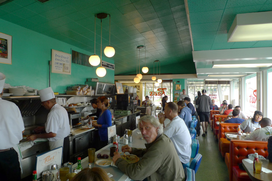
Inside, Rae’s employs the now-familiar linear organization – open kitchen on one side served by a counter, with banquettes against the window, roofline sloping upward and outward. The roof’s surface is interrupted by a soffit that brings in to the interior the floating horizontal plane of the exterior canopy. Posts and beams supporting this structure, here of wood rather than steel, seem relatively chunky. The sloped ceiling is kept clean with well coordinated triple-globe light fixtures. Front and center there is a man that looks like Donald Sutherland.

Bacon tidbit waffle! Savory sweet crunchy superior.
Leave a Reply