American fast food restaurant chains hit their major growth spurt in the middle of the century and were a building type intrinsically suited to the Lower Modernist mode. A playful architectural style that was inexpensive, easily replicated and recognizable matched the needs of these restaurants trying to establish the familiarity of their brands and implant franchises in the minds of consumers. The vaguely Modernist mode of this new breed of burger stands set them apart from the comparatively old-fashioned style of the independently owned diners that preceded them.

This location of Fosters Freeze, on Washington Boulevard near Marina Del Rey, has been selling soft serve to Westsiders since 1970. Nowadays it would go even without saying so that Fosters Freeze is old-fashioned.

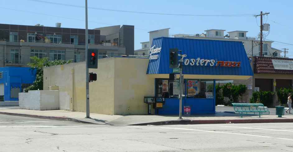
What makes this Fosters Freeze worth looking at is its exemplary implementation of the Gourmet Mansardic device. The application of a bright blue mansard gives this building, which is otherwise a pure dumb rectangle in plan, a three-dimensional character and imparts distinct identity even aside from the prominent signage mounted to it.

The mansardic device projects from two sides of the rectangular plan. Most buildings in the Gourmet Mansardic style are more symmetrical than this one – either the mansard projects from the front only, typical of buildings hemmed in on both sides by lot lines; or the mansard extends around all sides of the building, worn by the building like a hat. The two-sided mansard transforms a building that would look like a simple rectangle into a diagram building, conveying an expression of two masses of roughly equal size, one offset in three axes from the other.

The same functional effect – shielding the storefront portion of the exterior wall with an overhang – could have been achieved with a simple cantilevered flat canopy; but the mansardic treatment transforms the feel of the building and the impression that it makes, and does this in an inexpensive and expedient fashion. The mansardic element is what makes this building into an architectural expression: mathematically speaking, (architecture) – (building) = (mansard).

The blue mansard was the architectural trademark of Fosters Freeze in these years. Judging by a brief internet survey of images of other Fosters Freezes, Fosters’ plans were typically unique and site specific, unlike other branded franchises that featured a standard plan to be identically reproduced across the country, like McDonalds, Pizza Hut or Taco Bell. The identifying blue mansard could be applied to a variety of building configurations and still recognizably be a part of the Fosters extended family.

The mansard itself is clad in standing-seam metal panels, a classic choice, and painted in the trademark shade of blue. Rather than the expected flat soffit of cement plaster, the underside of the Fosters mansard has a sculptural quality, dropping down at an angle which when viewed from afar conceals the fluorescent strip light fixtures mounted in the soffit.

The plaster return is smoothly rounded in the transition from angle to flat; when viewed from a distance, this detail seems to soften the mansard. I believe that the mansard’s soft underbelly resonates with the softness of the soft-serve ice cream that Fosters sells. To take the analogy one step further, the metal panel mansard covering the soft-looking plaster soffit is a metaphor for the soft serve ice-cream cone that has been “dipped” in self-hardening chocolate.

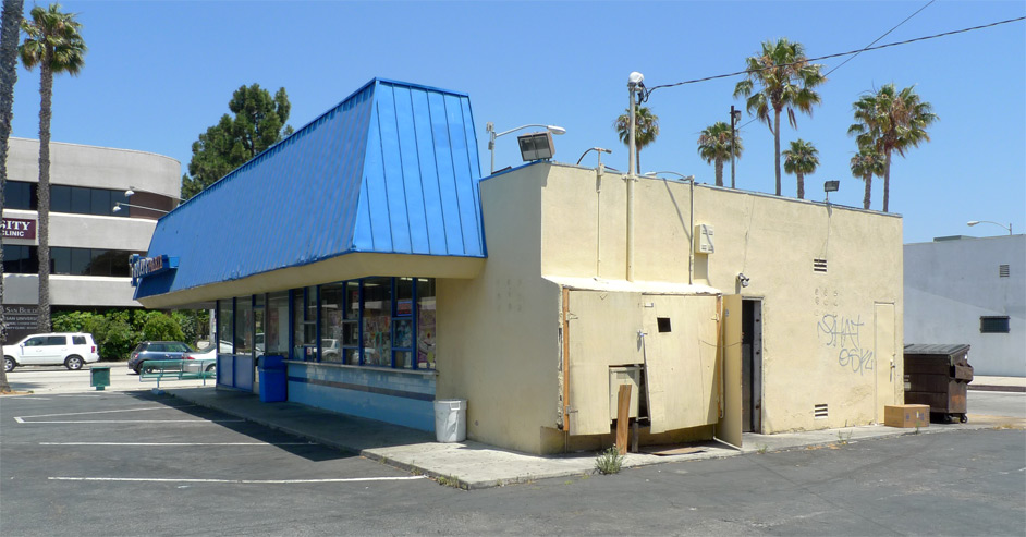
The actual construction of the mansard gives lie to the diagram – when viewed obliquely, one can plainly see that this is not an actual mansard but a Gourmet Mansardic device applied to the exterior of a conventional vertical-walled, flat-roofed building. Composition shingles rather than relatively expensive metal panels are used here where they are out of site.

A mural decorates the blank masonry wall of the neighbor’s building – a rounded-corner rectangle, a cartoon soft-serve cone, and a pun on “bunch” used to promote the banana split.
Leave a Reply