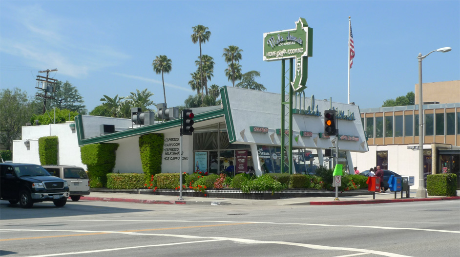
At the corner of Ventura Boulevard and Kester Avenue in Sherman Oaks, Mel’s Drive-In (formerly known as Kerry’s) exhibits a striking profile. Having seen it on the street before I knew what it was, I took it at first for a retro reproduction of a Googie coffee shop, only discovering later that it was built in 1953 and designed by the great Armét and Davis firm. In honor and memory of the late Eldon Davis, the May installment of the Googie Coffee Shops Bicycle Ride Series took us over the hills to pay Mel’s a visit.

Mel’s follows the classic Armét and Davis profile, with a roofline that angles up toward the street to define a space simultaneously cozy and open, although it is less sure of this diagram than later coffee shops like Pann’s and La Cienega Norm’s.

While we should be grateful that it is still operating at all, this coffee shop has suffered terribly from the heavy-handed interventions of the Mel’s Drive-In brand. It has fared far worse than the formerly Ben Franks location. Compare the photo above with how it looked in the mid-1980s in this image hosted on Flickr (one in a great set of 1980s photographs of mid-century Googie architecture):
http://www.flickr.com/photos/markvanslyke/4179993133
Here you can clearly see the mistakes made by the Mel’s remodel. The pylon sign was already bad by the 1980s, but Mel’s really went wrong in a few places – the contrasting edge of the angled roof line, the tile applied to the retaining wall that follows the sidewalk, and worst of all, what they did to the front along Ventura Boulevard.
The original design integrated the angled posts that support this roofline by expressing them all the way up and even a couple feet above the top of this roof-parapet element; we read it as an architectural element integrated with the roof of the building. Mel’s remodel cut off the expressive angled column elements in order to transform the front into something like a billboard, and applied a bunch of diner-like signage elements that lack relation to both the style and the structural module of the architecture. Seeing a poor remodel often brings the merits of an original design into starker relief.

The side view still communicates an essential architectural idea – the folded plate element of the roof, like a sideways capital-J, defines the volume of the dining area while a boxy, subordinate service area is conjoined at the back.

Inside, banquettes wrap around an L-shaped counter under a roofline sloped up toward the street. Organizationally, it’s a great and lively space; but the image below shows how badly the interior has been bollocksed up with retro junk steeped in nostalgia for a carpetbagging, invasive-species “diner” culture imported from Back East and/or Up North.

The scalloped stainless steel panels may be the worst of it, but the furniture is bad, the 2’x4’ acoustic panel ceiling is just a lazy thing to do, and the black-and-white photos applied to the inside face of the folded roof element ruin the diagram – it is supposed to look like the roof is folding down to create a sense of partial enclosure and shelter from the busy street. They killed the diagram. I beseech you: respect the diagram.

Visiting architecture can be a bittersweet experience. But the pancakes were righteous, and bacon power helped us to overcome pancake gravity on the return ride over Sepulveda Pass for the conclusion of a fine bicycle ride.
Leave a Reply