
Today the Chart House is a chain of steak and seafood restaurants owned since 2002 by Landry’s, the owner of an empire of high-end chain-restaurant brands such as Morton’s, Claim Jumper, and McCormick & Schmick’s. Judging by the Yelp! reviews, the remaining Los Angeles-area locations are expensive and mediocre.
Despite its present mediocrity, the Chart House was an influential leader in the development of the modern steakhouse chain restaurant with a legacy of architectural inventiveness. The first Chart House opened in Aspen in 1962, eventually expanding into a chain of more than fifty locations. Unlike contemporary fast-food chains, the Chart House did not seek to replicate an architectural prototype, but rather aimed to make each location unique:
Chart House wanted its buildings to be blessed with history (some were converted old houses), scenery, or imaginative new architecture, and the company didn’t complain when the works of talented designers turned out to be expensive (Philip Langdon, Orange Roofs, Golden Arches, 161).
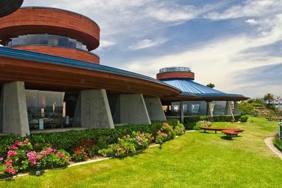
The organic late-modern Rancho Mirage restaurant, designed by Kendrick Bangs Kellogg, might have been the most architecturally distinguished, but sadly it burned and was demolished in 2013. Of the remaining Southern California restaurants, the DanaPoint location is the only one revealing architectural ambitions.
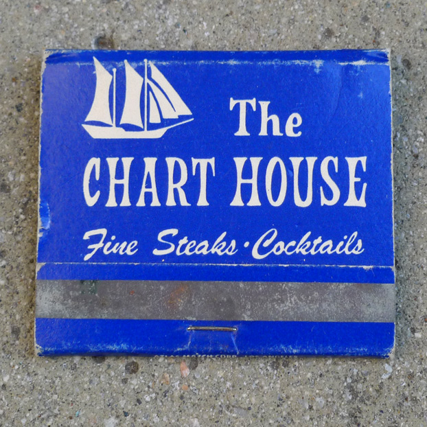
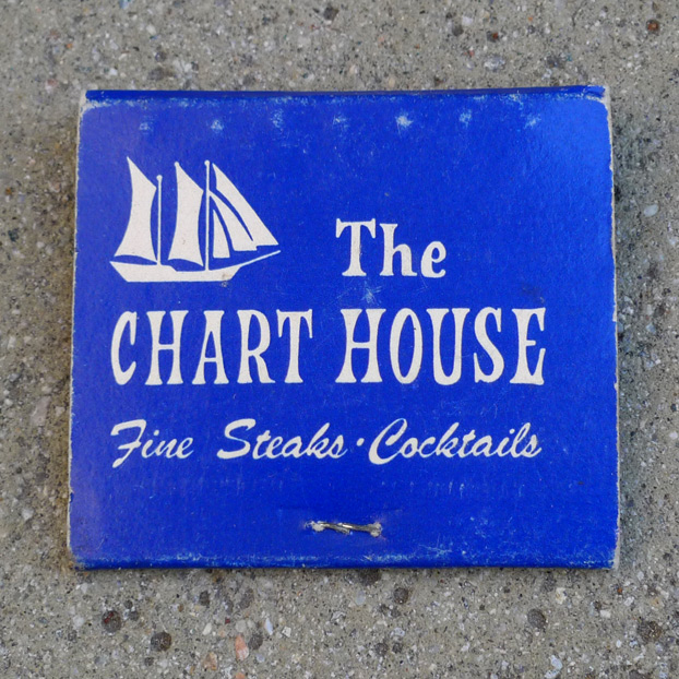
The Chart House took its name from that compartment of a ship in which the nautical charts are kept, and at its launch in the mountain resort of Aspen in 1962, the retro-nautical imagery must have seemed an evocation of the exotic, related to the nautical aspects of Tiki style. The simplified representation of a sailing ship in its logo reinforces the reference. The logogram combines “The” in title-case with “CHART HOUSE” in upper-case letters with exaggerated, bellbottom-like serifs – the letter style seems appropriate to the image, but I am not sure why. The simple, appealing logo featured on this matchbook has sadly been abandoned and replaced several times over, and the Chart House now uses a nasty logo with Bank Gothic: http://www.chart-house.com/ This new logo is incredibly lazy, and both its designer and its client deserve to share the blame, but perhaps the butch qualities it conveys appeal to the customers of expensive, mediocre chain restaurants.
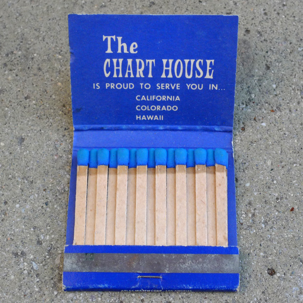
At the time the matchbook was printed, the Chart House’s locations were limited to California, Colorado and Hawaii, back when Chart House was still cool. The blue match heads are a nice match for the cover’s nautical blue and white.
Leave a Reply