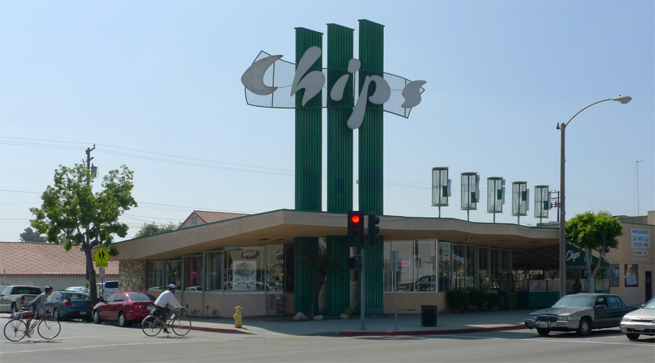
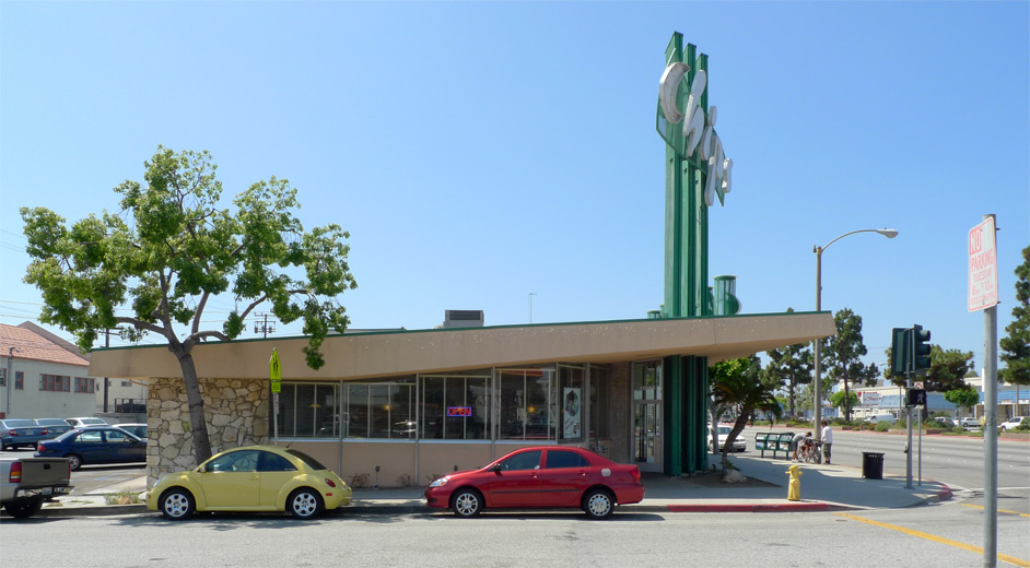
The July edition of the Googie Coffee Shops Bicycle Ride Series took us straight down La Brea to Chip’s Coffee Shop in the city of Hawthorne. Chip’s was built in 1957 to a design by architect Harry Harrison, and aside from the addition of a patio at its south end, appears to be pretty close to its original configuration.

The signage beckons. As Alan Hess observes in Googie Redux, “the extraordinary Chip’s signs are kinetically related to the movement of cars along the commercial strip” (112). The taller and larger sign is oriented toward the southbound traffic farther away, while nearer northbound traffic is addressed by five cylinders bearing independently the letters c-h-i-p-s.

The roof slope is not too steep and relatively subtle and undramatic, but tapered at each end, asymmetrically. There’s no telling whether there is any structural “truth” to this truss-like expression, but it’s a familiar googie move. Stylistically, Harrison’s coffee shop is a close relative of the work of Armét and Davis, most noticeably in the configuration where the roof slopes up toward the street, the interior space divided from exterior with only a minimal glazed storefront spanning from ground plane to roof.

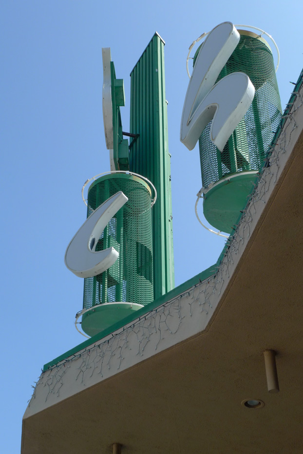
Facing Hawthorne Boulevard, the roof is clipped in a zig-zag in plan, as if punched by a giant cookie cutter. The signage drums are simply and expediently constructed of expanded metal rolled into a hoop, encircled with a loop of neon at top and bottom for nighttime effect. Viewed against the bright sky, the overlapping metal creates a shifting moiré effect as the observer passes.
As seen in the first picture, the drums sit on top of skinny steel posts, holding the drums a couple of feet above the plane of the top of roof; these posts also playfully extend down through the bottom of the soffit, such that the signage drums read like giant cocktail picks impaled through the roof slab.

The interior follows the Armét and Davis parti with its ceiling sloping up away from the kitchen toward the street, with the kitchen flanked by a counter and the window-wall flanked by banquettes.

Since becoming aware of it recently, I have been preoccupied by the “prospect-refuge theory” of geographer Jay Appleton, who argued that an innate desire for what he termed Prospect and Refuge lead to aesthetic preferences, which in turn might form a kind of ruleset for architects. Architect and writer Grant Hildebrand already beat me to this idea and has been applying the theory to architecture since the 1970s, so I know I’m not treading any new ground here, but I haven’t read either Appleton or Hildebrand yet so it’s all new to me.
I like the diagrammatic clarity of boiling coffee shop architecture down to a simple formula: glazed window wall as “prospect” + upsloped roof as “refuge” = objectively pleasing architectural space.

Leave a Reply