The architect and industrial designer, Eliot Noyes, earned his spot on the roster of the Patron Saints of the Lower Modernisms – despite living a classy and tasteful life in the American Northeast rubbing elbows with the rich and powerful, Noyes worked ceaselessly to expand the scope of Modernism in a downward direction. Early in his career, Noyes set the course for the Museum of Modern Art’s design department by mounting the 1940 exhibition “Useful Objects of American Design Under $10,” bringing common industrial household products into the museum for consideration as serious objects of design (the following two photographs show illustrations from Gordon Bruce’s book Eliot Noyes, a substantial survey of Noyes’s life and work).

Although Noyes’s portfolio contains a number of serious architectural commissions (including the former IBM building now occupied by Otis College in Los Angeles), his most familiar work to the average citizen consisted in corporate design programs for clients like IBM, Westinghouse, and Mobil.
Noyes began to work on Mobil Oil’s corporate design program in the mid-1960s, helping Mobil transform a confused design identity into a coherent and memorable one that still defines Mobil’s look to this day. The following spread shows prototypical service stations from the mid-1960s designed under Noyes’s program. These early stations bear enduring hallmarks, such as the circular motif in the design of the canopies and in Chermayeff and Geismar’s then-new Futura-based logotype.

As asserted in previous posts, lowbrow programmes like service stations have traditionally been considered mere buildings, beneath the threshold of Architecture. In the case of his Mobil stations, Noyes elevated what had been heretofore a particularly junky type of building and gave it the respect to treat it as a real design problem, thereby elevating it into the realm of Architecture; simultaneously thereby expanding the discipline’s domain downward to encompass a building type previously below the reach of architects. Although these stations are all around us, their qualities are all too easily overlooked, and this essay intends to highlight some of their architectural merits.
Our survey begins with two fine specimens of Mobil stations based on Noyes’s standards, both complete and equipped with “Mobil Mart” stores. The well preserved example at the northwest corner of Highland Avenue and Melrose Avenue seems to be from 1988 according to a records search. Its canopy shelters three pump islands. Although the station itself is a controlled visual environment, the designers’ efforts have been unable to control the visual clutter of billboards and street furniture that surround the station.
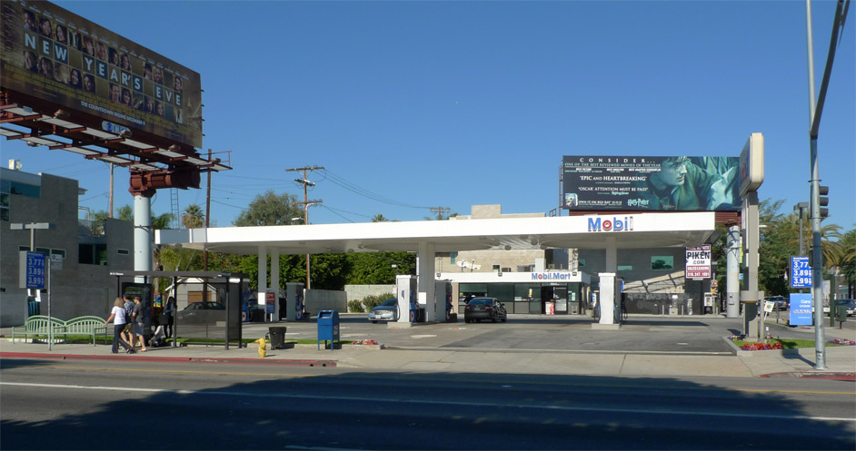
Mobil’s signature circle motif appears as an expressed element in the underside of the canopy, both projecting downward and defining a relieved inset, as though an enormous cookie cutter were involved in the process. The circular cutout is a branding atavism, making reference to the circular canopies seen in the earlier prototypes depicted above. Formally, this design move is the opposite of what would have been the more obvious approach of dropping the circles as a lowered soffit within the canopy, which also would have had a structural logic, like a “drop cap” at the head of a column in a concrete building; in this case the non-obvious contrary move is so much better.
The builders spent extra to get rounded corners where the concrete paving meets the asphalt, echoing the rounded corners of the canopy above.

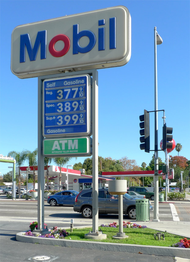
Rounding the corners of rectangles was generally a high priority throughout the Mobil design program, employed in every part of this company-standard signage.
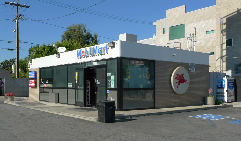
The Mobil Mart is a species of the Perfect Building, designed with extreme discipline and as few details as possible – you could study a photo of it for twenty seconds and thoroughly memorize its architectural characteristics. My personal dream is to adaptive-reuse one of these as a house (the accompanying canopy would make a fine lanai in support of Gracious California Living). The white, solid top-of-wall is expressed as though it were the edge of a solid, thick roof slab, another rounded-corner rectangle element, in mimicry of the pump island canopy. Both glazed storefront and running-bond opaque wall flush out precisely with this roof element, separated by a horizontal reveal of consistent width.
The circular motif reappears in the Pegasus sign.
The top-of-wall detail nears perfection – it is both nearly seamless and lacking any unsightly cap-flashing that would detract from its diagrammatic clarity. The large light openings of wired glass achieve a shimmering, diaphanous effect in the sunlight. The black mullions, grey spandrel glass, and grey concrete podium all reinforce the Modernist graphic quality of this composition.

At the corner of Atlantic Boulevard and Beverly Boulevard in East Los Angeles there persists a second complete Mobil station of high design integrity, this one also comprising three pump islands under a single long canopy.
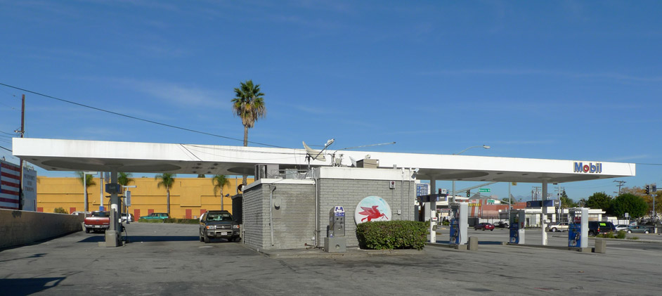
The material palette and detailing adhere closely to the Mobil standards and resemble those used at the Melrose/Highland location, but this configuration, typical of Mobil stations on larger sites, differs. The canopy’s length is as if planned for four pump islands of equal spacing, but in place of the third spot, the Mobil Mart has been slid halfway under the canopy. Perhaps the Mobil Mart was added later in replacement of a pump island.

Following classical Lou-Kahn Modernist philosophy, the Mobil Mart is unattached to the canopy and detailed to make this separation evident – the plane of the canopy floats freely above the mass of the Mobil Mart like a ramada. A second, shorter building, detached from the Mart and also hanging halfway out of the canopy’s shelter, contains the washrooms.
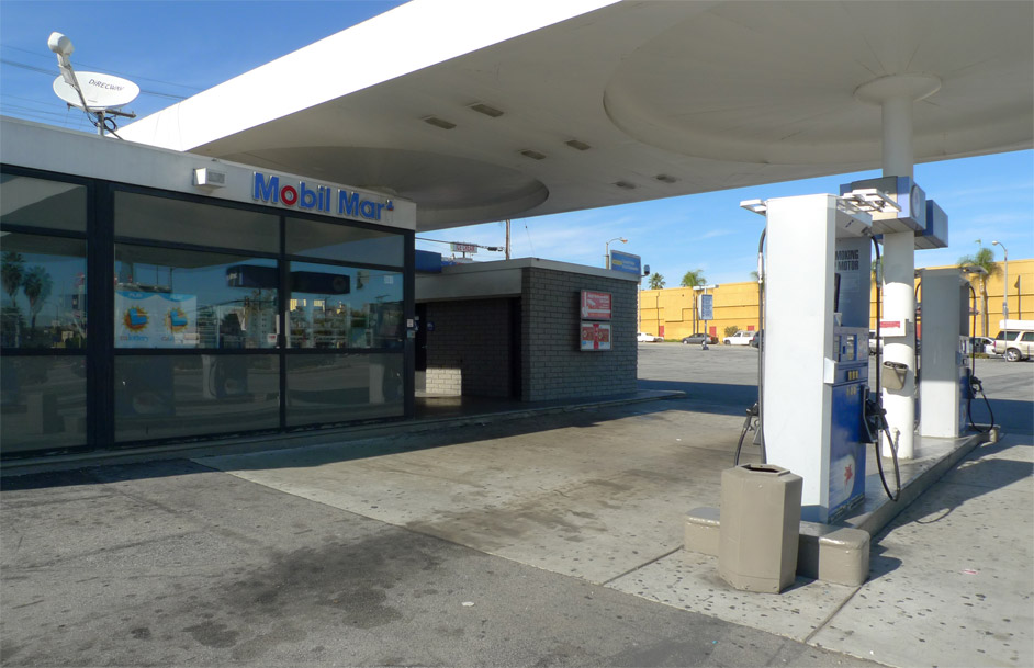
The sheltered outdoor court separating the Mobil Mart from the washrooms recalls the house Noyes designed for himself and his family in New Canaan, Connecticut, which consists of separate living and sleeping pavilions connected by a breezeway. The Mobil Marts also share in common with Noyes’s home certain expressive tactics – lightweight glazed panels contrast with heavy masonry walls, both topped with a horizontal plane of roof.
Rounded-corner rectangles:
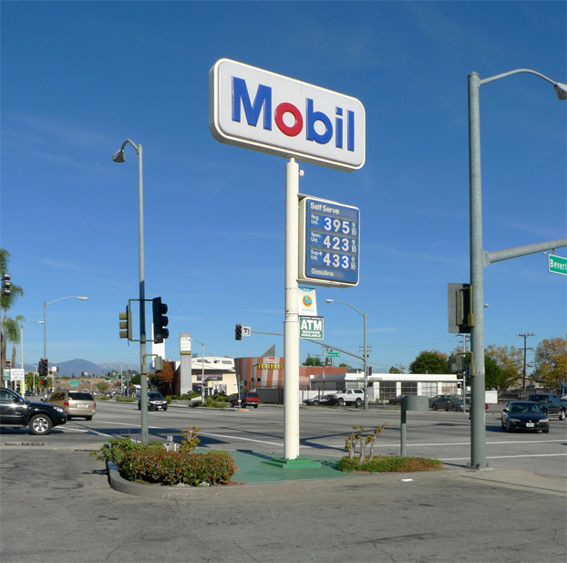
The historical design integrity of the two Mobil stations described above is unfortunately exceptional, as Mobil has for years been desecrating their service stations in a misguided effort to update their look. The Noyes-pattern Mobil service station is now Endangered Lomo – visit these sites while you can, maybe buy yourself a tank of Regular Unleaded, as it is unlikely that a ragtag army of historical preservationists will be coming to their defense anytime soon. It is a different story in England – a circle-pattern Mobil station there was recently “listed” as an historical property, undoubtedly adding the A6 at Red Hill, Leicestershire, to the itineraries of eager heritage fanatics.
The fucking-up of Noyes-pattern Mobil stations has taken three typical forms. The type-1 defacement is the application of blue paint or film to the fascia edge of the canopy. This blue band covers approximately the top 2/3 of the canopy, and is interrupted at the Mobil signage. In struggling to think of an explanation for why this would constitute an improvement over the original design, I hypothesize that the all-white look of the Noyes canopy was considered too “plain.” The blue stripe modifies the figure-ground relationship of the canopy, having the effect of emphasizing the vertical surface of the canopy edge as a ground, while making the canopy thereby read less like a horizontal slab. This example is found on Sepulveda Boulevard south of Ventura Boulevard in Sherman Oaks:

The type-2 defacement is the application of a blue projecting box to the canopy’s edge. Sometimes backlit, this intervention, similar to the type-1 blue paint, has a destructive effect on the legibility of the canopy. Here are before-and-after views of the Mobil station at the corner of Crenshaw Boulevard and Adams Boulevard:
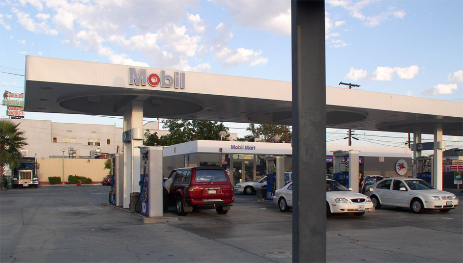
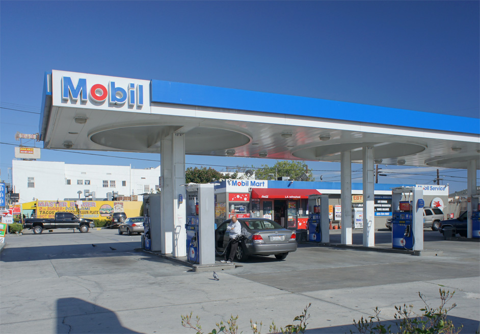
If you look closely, you can discern that they have actually squared off the canopy’s rounded corner when they undertook the remodel (sometime after the original photograph was taken in 2006). The Mobil signage has also been replaced and relocated, and the Mobil Mart building has received new signage and a type-1 blue stripe.
The type-3 defacement is the application of a projecting white eyebrow from the front of the Mobil Mart building. This eyebrow is usually white and aligned with the bottom 1/3 of the Mart’s top-of-wall, following the logic established by the type-1 blue striping. It projects outward approximately one foot, providing a modicum of weather protection for the doorway. The projection occurs only on the front, disrupting the four-sided, Perfect-Building equivalence of the underlying architecture. The station at the corner of Washington and Crenshaw Boulevards exemplifies:

The aforementioned three types of defacements – practical case studies in bad design sense – can be spotted all over town. What inspired this report and elevated it to emergency status, however, was a glimpse of an even more execrable defacement. At the Mobil station at the corner of Figueroa Boulevard and Adams Boulevard, the Mobil Mart half-sheltered beneath an otherwise clean canopy has been transformed into a Circle K Mart:
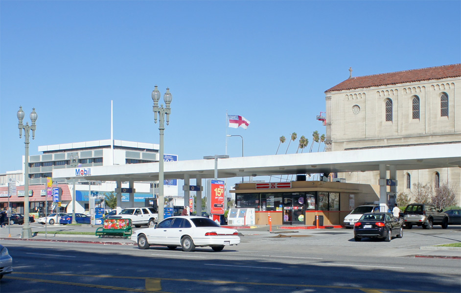
Painted a sickly fleshtone, the abstract menace of this architecture-turned-zombie hides half concealed in the shade of the pristine white canopy. The closer I look at its details – such as the matching fleshpaint applied over the spandrel glass – the more I feel as though my brain is being eaten.
Bibliography:
Bruce, Gordon. Eliot Noyes: A Pioneer of Design and Architecture in the Age of American Modernism. New York: Phaidon, 2006.
For further reading on the subject of service station design:
http://pleasantfamilyshopping.blogspot.com/2011/03/golden-age-of-gas-stations.html
Leave a Reply to Elisabeth Uyeda Cancel reply