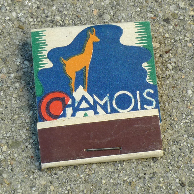
Thanks to Wikipedia, I have learned that SEITA was the Service d’Exploitation Industrielle des Tabacs et Allumettes – the French national tobacco monopoly. It appears that “Chamois” was a trademark for matches that they distributed. This was among the only foreign matchbooks in the collection I inherited, so evidently the collector was not a frequent traveler, but I hope that he did make it to France at least the one time.

The design is really pleasing – the gritty, analog quality of the three-color printing and cheap card stock gives it a rustic look. The letter “A” has been stylized into a mountain on which a chamois is perched. As you may know, a chamois is “a small goatlike bovid (Rupicapra rupicapra) of mountainous regions from southern Europe to the Caucasus.”

I am not sure if the stalagmity border is supposed to resemble something in particular, but it gives the sense that the SEITA logogram is illuminated within a clearing, as if in the woods.

The matchsticks themselves are of wood.

Leave a Reply