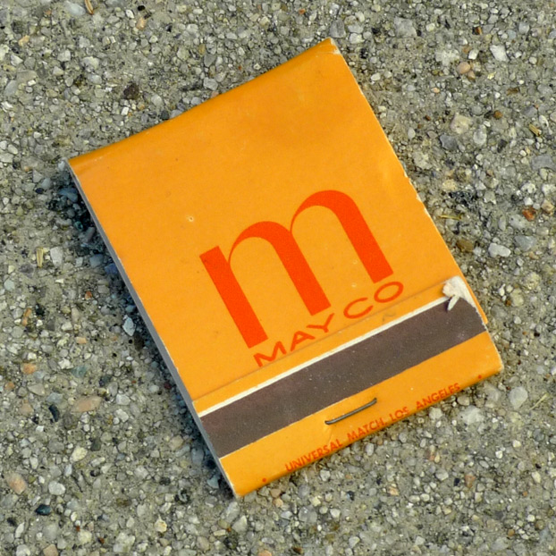
May Company was one of the great American department store chains until 2006, when the brand was entirely subsumed by Macy’s. The now extinct May Co. brand will be remembered by architectural historians for its great late-Streamline Moderne store at the corner of Wilshire and Fairfax, designed by A.C. Martin, which is now a part of the LACMA museum complex and known as LACMA West.
The “Department Store Museum” blog has a collection of renderings of May Co. stores in a variety of classic shopping-mall anchor-store architectural styles from the 1950s through the 1970s: http://departmentstoremuseum.blogspot.com/2010/06/may-co-cleveland-ohio.html
On to the matchbook. We don’t know what year it is from, although we have some clues. It is challenging to search-engine “may company logo” and find anything meaningful, but helpful commenter Randy left a remark on the afore-referenced Department Store Museum page:
“The 70s-era “Big M” logo you have between the downtown store address, is that from the Los Angeles May Co. division. The Cleveland May Co. had two versions of the “Big M” logo.”

The color scheme of the matchbook is a lot like the mustard-and-ketchup colorway eventually adopted by nearly every fast-food chain, colors we allegedly associate with hunger and stimulation; but one suspects the path of causality, rather than due to the intrinsic appropriateness of yellow and red for this programme, is that many fast-food chains chose yellow and red because other fast-food chains had already used yellow and red and established the semiotic connection.
The letter “m” of May Co. is similar to, but more streamlined than, that of the typeface Optima, designed by type designer Hermann Zapf in 1952. Optima became a popular choice in design and architectural circles in the 1960s and 1970s, a sans-serif and minimalist typeface but perceived as more elegant and humane than the dominant Helvetica. For years it was the standard for Architectural Record’s books and magazine. May’s “m” is exaggerated, with great variation in stroke width made possible by its large size; and the precision of its geometry demands that it be read not just as a letter but as a figure consisting of three vertical bars adjoined by a curvy tapered extension at the top of two of the bars. The contrasting “MAY CO” in a squashed small-caps face plays against the “m”, carefully aligning with the bars of the “m” above.

The backside of this book is minimalist – plain and mustard-colored, this matchbook is here to help you light your cigarette while you do your shopping, not taunt you with advertising jingles.
Leave a Reply